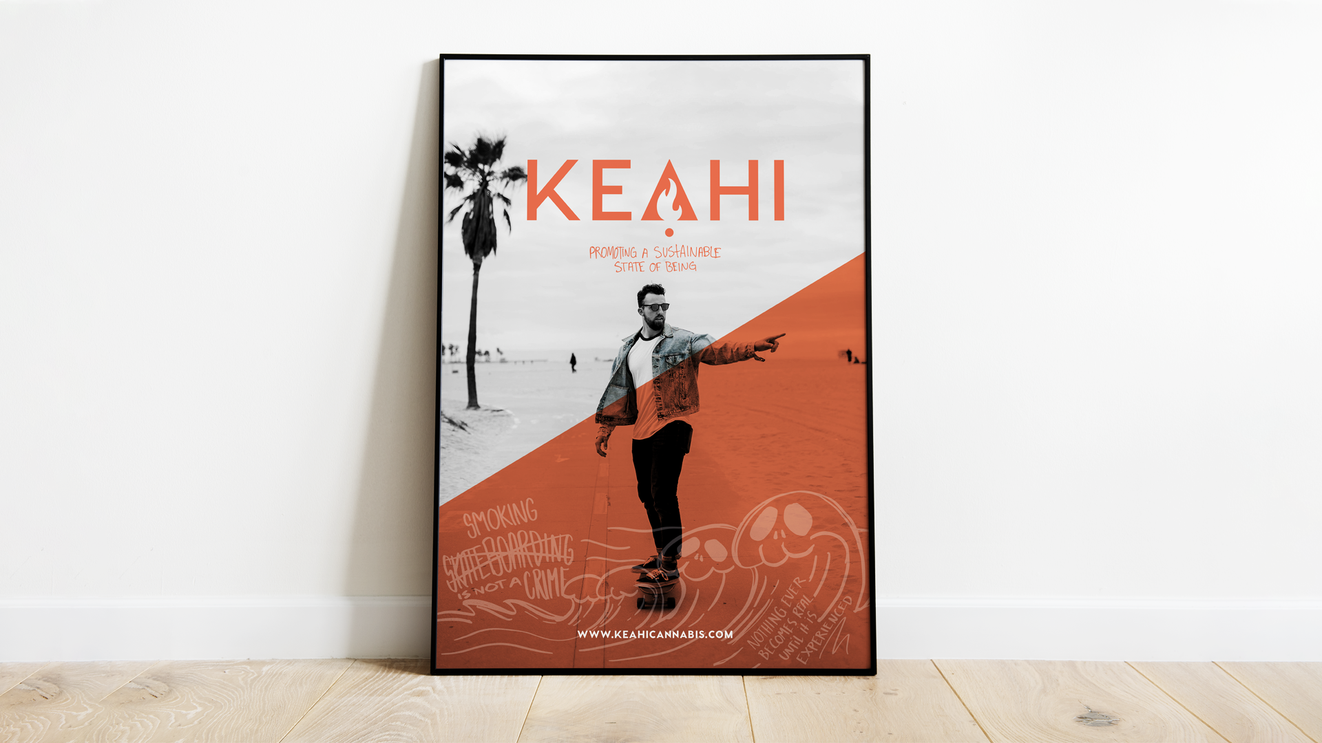
KEAHI
Branding/Packaging Project
Honolulu, Hawaii
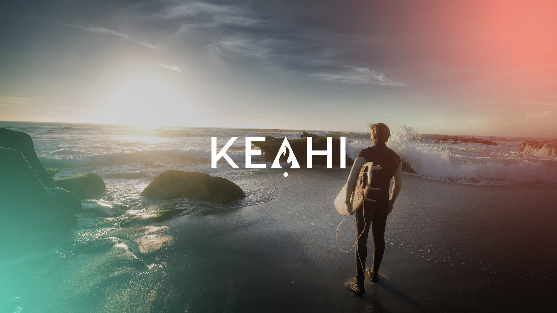
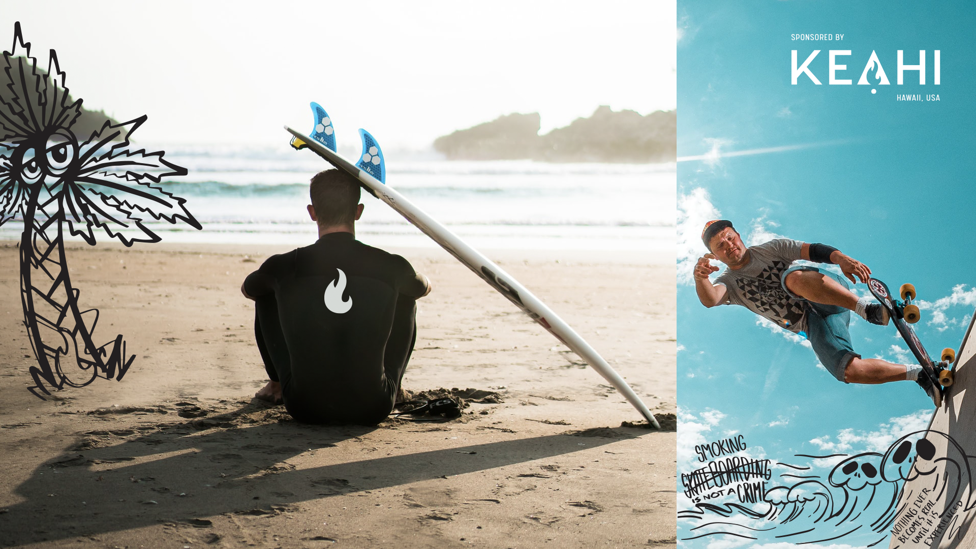
Keahi is a cannabis concentrate brand rooted in surf and skate culture, with a focus on sustainability and premium quality. The vision was to create a lifestyle-forward identity that speaks to a conscious, design-savvy consumer—balancing bold aesthetics with environmentally mindful packaging.
I led the creative development for the brand’s visual identity and packaging, crafting custom illustrations and design assets from concept through final production. My role encompassed branding strategy, packaging systems, and storytelling through design—building a look and feel that reflects both the laid-back energy of coastal culture and the high potency of the product itself.
The name Keahi—meaning "fire" in Hawaiian—echoes the brand’s roots and the cannabis community’s slang for top-tier product, reinforcing both cultural meaning and product excellence
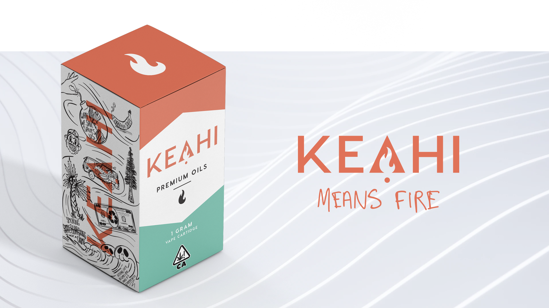
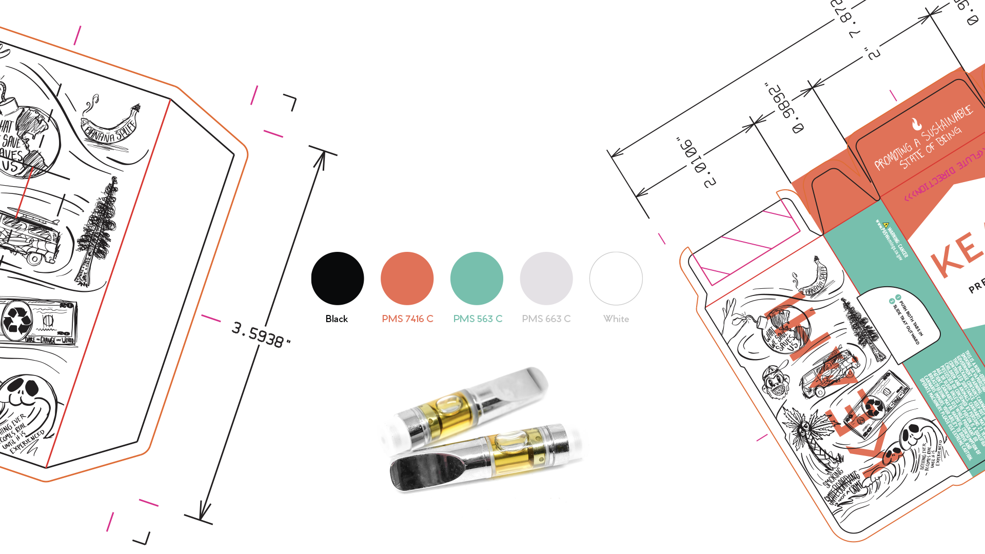
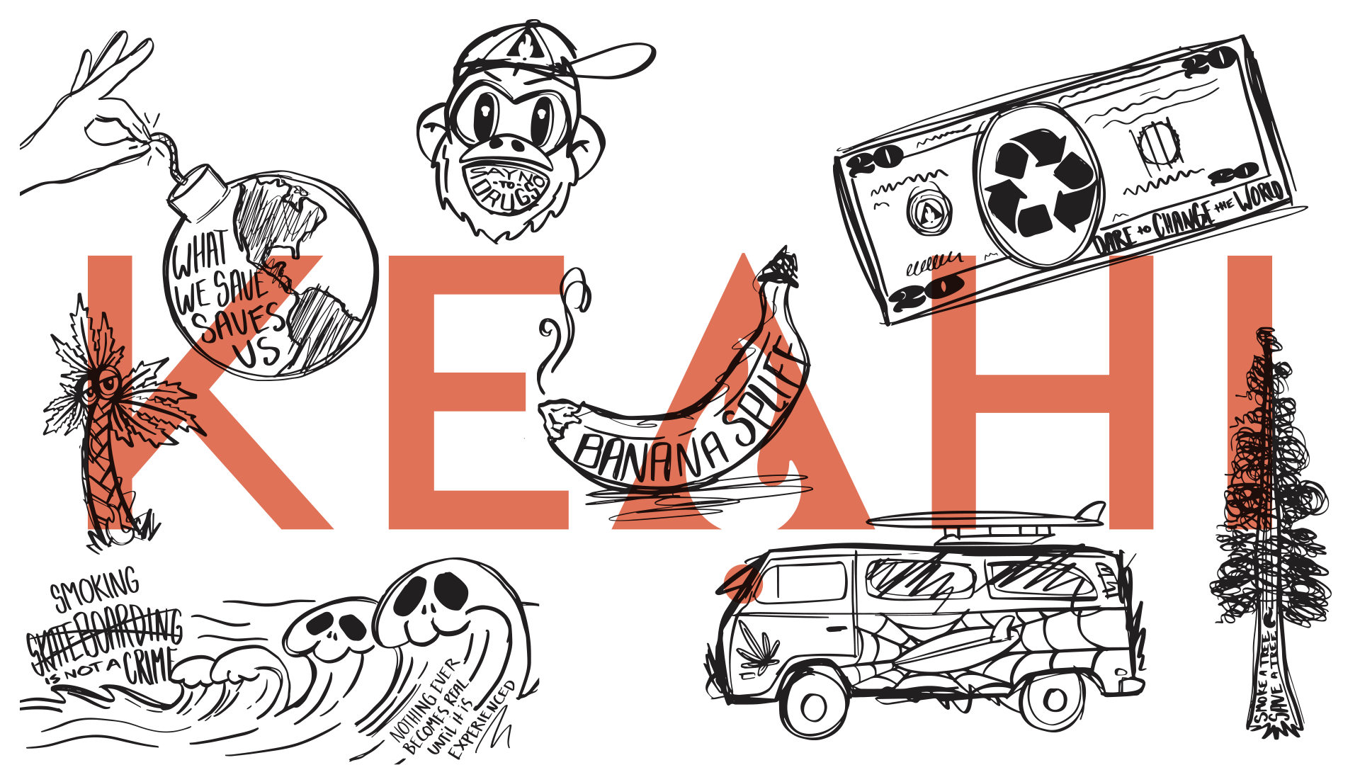
Illustrations:
Keahi wanted various illustrations that were purposefully drawn roughly. The scribble style was very unique to them and stood out amongst other brands. All illustrations are presented on the side of the box and each box contains a sticker with one of the illustrations.